
What is explainability?
Before we discuss what can be explained and how we can explain it, let’s define what we mean by ‘explainability’. This is far from the only definition and there is little consensus in research or the industry on what XAI really is. But one good working definition is that explainability are
Methods and models that make the decisions and behavior of machine learning models understandable to humans.

Source: https://christophm.github.io/interpretable-ml-book/terminology.html
Why XAI?
There are a number of good reasons why we may want to explain ML models or their decisions.
- As ‘challengers’ to strictly regulated models: If we can successfully explain relatively complex and ‘black box’ models, then these models (which often come with better precision) can serve as challengers to strictly regulated models (think the credit risk domain, for example)
- Social acceptance and trust: We humans do not trust something we do not understand. People with little experience with ML will tend to be especially sceptical.
- Model debugging and robustness: This is the reason most cited by data scientists and engineers when it comes to how XAI can help them.
- Bias detection: Though I believe there are better ways to purely measure bias in your data or model, XAI could sometimes reveal some unexpected bias embedded in our algorithms
Why not XAI?
However, we should be careful with when and how we apply explainability. XAI is not a must-have in every single use case. Here are some reason to apply XAI with special caution:
- It can lead to distrust: If we reveal some very opaque processes and features, stakeholders are going to trust the model less, not more
- If not careful, we can reveal some proprietary information about the model or the data it has been trained on
- Last but not least, we do not want to give malicious parties the opportunity to ‘game the system’ by providing them with a recipe on how to commit further fraudulent activities in a manner, which won’t be detected
Types of explainability approaches
When it comes to explaining the models and/or their decisions, multiple approaches exist. One may want to explain the global (overall) model behaviour or provide a local explanation (i.e. explain the decision of the model about each instance in the data). Some approaches are applied before the building of the model, others after the training (post-hoc). Some approaches explain the data, others the model. Some are purely visual, others not.
What do you need to follow this hands-on tutorial?
To follow this tutorial, you will need Python 3 and some ML knowledge as I will not explain how the model I will train works. My advice is to create and work in a virtual environment because you will need to install a few packages and you may not want them to disrupt your local conda or pip setting.
Here are the instruction on how to create a pip virtual environment:
- Install the virtualenv package (where the --user is not always required but you may need it depending on the permissions you have on your machine)
pip install --user virtualenv - Create the virtual environment
virtualenv my_environment - Activate the virtual environment
- Mac/Linux
source my_environment/bin/activate - Windows
my_environment\Scripts\activate - Deactivate
deactivate - To be able to run Jupyter notebook or JupyterLab, you need to install ipykernel on your virtual environment. Make sure you have activated and are working in your virtual environment. Again, --user is not always required.
pip install --user ipykernel - Next, you can add your virtual environment to Jupyter by:
python -m ipykernel install --user --name=my_environment
Now, what versions of the packages we will use should you install?
- sklearn = 0.22.1
- pandas = 1.0.4
- numpy = 1.18.1
- matplotlib = 3.3.0
- shap = 0.34.0
- pycebox = 0.0.1
Import data and packages
We will use the diabetes data set from sklearn and train a standard random forest regressor. Refer to the sklearn documentation to know more about the data (https://scikit-learn.org/stable/datasets/index.html )
from sklearn.datasets import load_diabetes
import pandas as pd
import matplotlib.pyplot as plt
from sklearn.ensemble import RandomForestRegressor
import pycebox.ice as icebox
from sklearn.tree import DecisionTreeRegressor
import shap
Import data and train a model
We import the diabetes data set, assign the target variable to a vector of dependent variables y, the rest to a matrix of features X and train a standard random forest model.
In this tutorial I am skipping some of the typical data science steps, such as cleaning, exploring the data and performing the conventional train/test splitting. But by all means, do perform these steps in a regular data science use case!
raw_data = load_diabetes()
df = pd.DataFrame(np.c_[raw_data['data'], raw_data['target']], \
      columns= np.append(raw_data['feature_names'], ['target']))
y = df.target
X = df.drop('target', axis=1)
# Train a model
clf = RandomForestRegressor(random_state=42, n_estimators=50, n_jobs=-1)
clf.fit(X, y)
Calculate the feature importance
We can also easily calculate and print out the feature importances after the random forest model. We see that the most important is the ‘s5’, one of the factors measuring the blood serum, followed by ‘bmi’ and ‘bp’.
# Calculate the feature importances
feat_importances = pd.Series(clf.feature_importances_, index=X.columns)
feat_importances.sort_values(ascending=False).head()
s5     0.306499

bmi    0.276130

bp     0.086604

s6     0.074551

age    0.058708

dtype: float64
Visual explanations
The first approach I will apply is called Individual conditional expectation (ICE) plots. They are very intuitive and show you how the prediction changes as you vary the feature values. They are similar to partial dependency plots but ICE plots go one step further and reveal heterogenous effects since ICE plots display one line per instance. The below code allows you to display an ICE plot for the feature ‘bmi’ after we have trained the random forest.
# We feed in the X-matrix, the model and one feature at a time
bmi_ice_df = icebox.ice(data=X, column='bmi',
                   predict=clf.predict)
# Plot the figure
fig, ax = plt.subplots(figsize=(10, 10))
plt.figure(figsize=(15, 15))
icebox.ice_plot(bmi_ice_df, linewidth=.5,  plot_pdp=True,
         pdp_kwargs={'c': 'red', 'linewidth': 5}, ax=ax)
ax.set_ylabel('Predicted diabetes')
ax.set_xlabel('BMI')
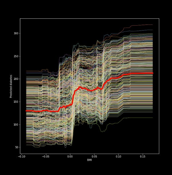
Figure 1. ICE plot for the ‘bmi’ and predicted diabetes
We see from the figure that there is a positive relationship between the ‘bmi’ and our target (a quantitative measure for diabetes one year after diagnosis). The thick red line in the middle is the Partial dependency plot, which shows the change in the average prediction as we vary the ‘’bmi’ feature.
We can also center the ICE plot, ensuring that the lines for all instances in the data start from the same point. This removes level effects and makes the plot easier to read. We only need to change one argument in the code.
icebox.ice_plot(bmi_ice_df, linewidth=.5,  plot_pdp=True,
         pdp_kwargs={'c': 'blue', 'linewidth': 5}, centered=True, ax=ax1)
ax1.set_ylabel('Predicted diabetes')
ax1.set_xlabel('BMI')
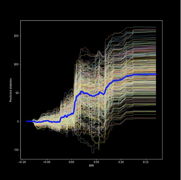
Figure 2. Centered ICE plot for the bmi and predicted diabetes
The result is a much more easy to read plot!
Global explanations
One popular way to explain the global behaviour of a black box model is to apply the so-called global surrogate model. The idea is that we take our black-box model and create predictions using it. Then we train a transparent model (think a shallow decision tree, linear/logistic regression) on the predictions produced by the black-box model and the original features. We need to keep track of how well the surrogate model approximates the black-box model but that is often not straightforward to determine.
To keep things simple, I create predictions after our random forest regressor and train a decision tree (relatively shallow one) and visualize it. That’s it! Even if we cannot easily comprehend how the hundreds of trees in the forest look (or we don’t want to retrieve them), you can build a shallow tree after it and hopefully get an idea of how the forest works.
We start with getting the predictions after the random forest and building a shallow decision tree.
predictions = clf.predict(X)
dt = DecisionTreeRegressor(random_state = 100, max_depth=3)
dt.fit(X, predictions)
Now we can plot and see what the tree looks like.
fig, ax = plt.subplots(figsize=(20, 10))
plot_tree(dt, feature_names=list(X.columns), precision=3,
           filled=True, fontsize=12, impurity=True)
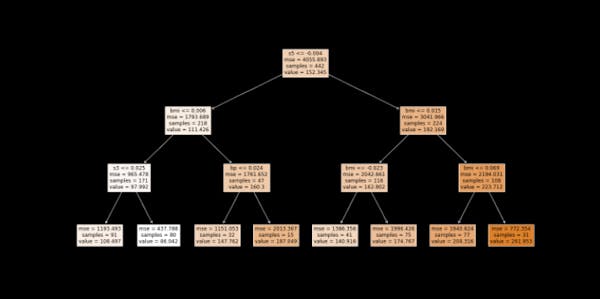
Figure 3. Surrogate model (in this case: decision tree)
We see that the first split is at the feature ‘s5’, followed by the ‘bmi’. If you recall, these were also the two most important features picked by the random forest model.
Lastly, make sure to calculate R-squared so that we can tell how good of an approximation the surrogate model is.
We can do that with the code below:
dt.score(X, predictions)
0.6705488147404473
In this case, the R-squared is 0.67. Whether we deem this as high or low would be very context dependent.
Local explanations with Shapley values
The Shapley values calculate the marginal contribution of each feature on an instance level compared to the average prediction for the data set. It works on classification and regression tasks, as well as on tabular data, text and images. It includes all of the features for each instance and ensures a fair distribution of the contributions of the features.
I will work with the shap package. I don't think there is another established package for Shapley values in Python.
Since I have trained a random forest model, the TreeShap would be the most appropriate approach (also since it was proposed as a faster alternative to KernelShap).
# explain the model's predictions using SHAP values
# This is the part that can take a while to compute with larger datasets
explainer = shap.TreeExplainer(clf)
shap_values = explainer.shap_values(X)
We can look at the Shapley values for one instance. We see how each feature's contribution is pushing the model's output from the base value to the model output for the concrete instance. In red are features that increase the contribution, and in blue- are those that decrease it. We see the concrete values of the features for that one instance (below), and their contribution.
# load JS visualization code to notebook
shap.initjs()
plt.style.use("_classic_test_patch")
# visualize the first prediction's explanation (use matplotlib=True to avoid Javascript)
shap.force_plot(explainer.expected_value, shap_values[0,:], X.iloc[0,:], matplotlib=True, figsize=(22, 4), \
                text_rotation=30)

Figure 4. Shapley values for the first instance in the data
If we have many features, they’d be a bit difficult to visualize meaningfully in a plot like this. Therefore, we may want to supplement a plot like the above one with a table, which shows the shapley values of each feature for the instance of interest. Here is the code to extract the Shapley values for the same first instance.
shap_vals = shap_values[0, :]
feature_importance = pd.DataFrame(list(zip(X.columns, shap_vals)), columns=['column_value','shap_vals'])
feature_importance.sort_values(by=['shap_vals'], ascending=False,inplace=True)
feature_importance
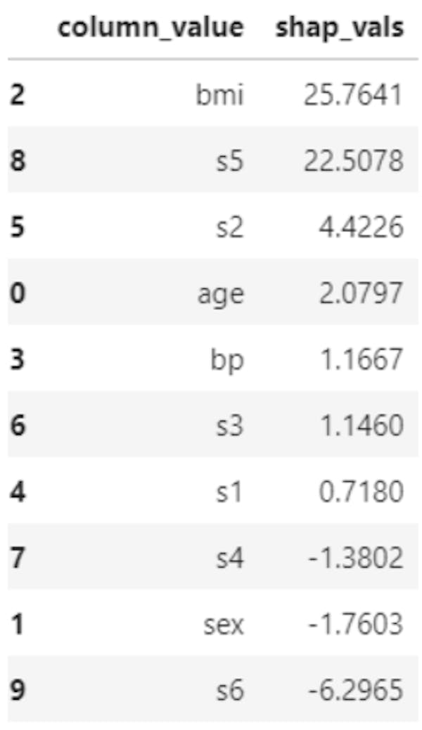
Table 1. Shapley values and features names for first instance in the data
Note that if we have hundreds or thousands of features in the algorithm, this table may not be very helpful either. It is always a good idea - if possible - to get rid of redundant features before you apply an explainability approach of interest.
Last but not least, we can combine feature importance with feature effects. Each point on the below summary plot is a Shapley value for a feature and an instance. The position on the y-axis is determined by the feature and on the x-axis by the Shapley value. The color represents the value of the feature from low to high. Overlapping points are jittered in y-axis direction, so we get a sense of the distribution of the Shapley values per feature. The features are ordered according to their importance. So this plot in a way gives us an idea about the global feature importance as well.
# summarize the effects of all the features
shap.summary_plot(shap_values, X)
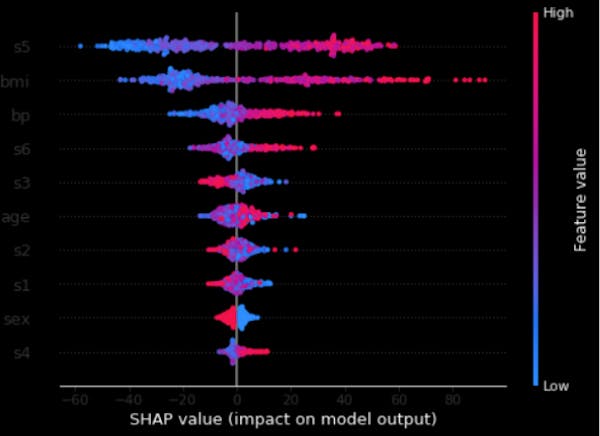
Figure 5. Shapley and feature values
Conclusion and next steps
We defined machine learning explainability as well as what are some good reasons to deploy it (or not). We briefly discussed the types of explanations we can provide before we dived into a use case where we used Python and an open data set to apply a few approaches. But this is just the tip of the iceberg! XAI is a very big and rapidly developing field. There are many more methods that explain either particular algorithm as well as model-agnostic ones which work on any type of an algorithm.
I hope you have gained some momentum and followed along in applying these explainability techniques. As a next step, take another dataset (maybe a classification problem this time) or apply them to a real use case you are working on. In either case, keep on learning and have fun with it!