DataViz
Data visualization, often referred to as DataViz, is the graphical representation of information and data. By using visual elements like charts, graphs, and maps, DataViz helps to communicate complex data insights in a clear and accessible manner. It plays a crucial role in various fields, including business, science, and journalism, enabling stakeholders to make informed decisions based on visualized data trends and patterns. Despite the proliferation of tools available for creating visualizations, challenges remain in achieving the right balance between aesthetics and functionality, as well as ensuring that visualizations effectively convey the intended message without oversimplifying the data.

SweetViz for Quicker In-depth Exploratory Data Analysis
As a data scientist, you love exploratory data analysis - unfolding insights from the data. SweetViz helps you fast-track and deliver better insights in lesser time.
📚 Read more at Towards AI🔎 Find similar documents
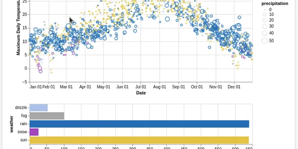
Interactive Data Viz using Altair
While working on a Data Viz project, everyone wants to present interactive plots on their notebooks and dashboards. Although it seems quite a daunting task to build effective & interactive plots…
📚 Read more at Analytics Vidhya🔎 Find similar documents
DataVis Battle Entry: Getting to know my Pokémon
This is my second entry to the DataVis challenge on Reddit. Data source: Kaggle and Bulbepedia for images. All the graphics are done in Python, using Plotly and Matplotlib. Also, as a disclaimer, I’m…...
📚 Read more at Towards Data Science🔎 Find similar documents

Can we save DataViz? Or is it just dashboards now?
2012 was a heady time. I had left science to try turning a hobby, graphic design, into a career. What I didn’t realize was how lucky my timing was. Data visualization was gaining serious traction in…
📚 Read more at Towards Data Science🔎 Find similar documents

Boost your Data Viz Productivity
Data visualization is paramount to understand the beauty of data analytics. Through data visualization, our stakeholders understand the impacts of our analysis. It helps them focus and make informed…
📚 Read more at Towards Data Science🔎 Find similar documents
XrViz: An interactive visualisation interface for Xarrays
XrViz is an interactive, in browser visualisation interface for Xarrays backed by the full power of the Python ecosystem. It allows controlled data points selection, massive rendering, data display…
📚 Read more at Level Up Coding🔎 Find similar documents
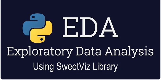
Powerful EDA using SweetViz Library in Python
SweetViz is an open-source Python library that generates Beautiful and high-density visualizations to kickstart EDA(Exploratory Data Analysis) with a single line of code. The output is a fully self-co...
📚 Read more at Analytics Vidhya🔎 Find similar documents

Data Visualisation — making data visible
Data visualization is the graphical representation of information and data. By using visual elements like charts, graphs, and maps, data visualization tools provide an accessible way to see and…
📚 Read more at Analytics Vidhya🔎 Find similar documents
Frustrations with DataViz Tools
I’m frustrated by the scope of tools currently available for data visualization work. They’re rapidly proliferating, but often are trying to solve exactly the same problems, and tackle them from…
📚 Read more at Towards Data Science🔎 Find similar documents

Data Collaboration Made Easier
Every data science/analytics team has faced difficulty in managing, organizing, and collaborating datasets that they are working on. DataLogz is a free web tool that offers teams to organize data with...
📚 Read more at Towards AI🔎 Find similar documents
Autoviz: Automatically Visualize any Dataset
Visualization is a technique that is used to visualize the data using different graphs and plots. In data science, we generally use data visualization techniques to understand the dataset and find…
📚 Read more at Towards Data Science🔎 Find similar documents

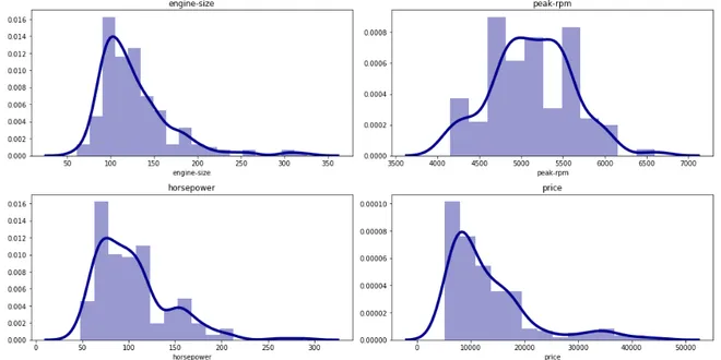
Master DataViz with Seaborn
A Guide to Creating Over 30 Statistical Charts for Data Science This tutorial aims to build graphs to support the data science process. Visualizations can be used during exploratory analysis, before ...
📚 Read more at Python in Plain English🔎 Find similar documents