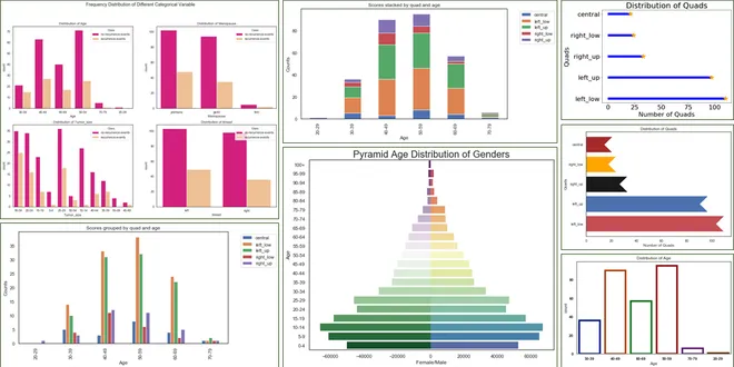
grouped bar chart
A grouped bar chart, also known as a clustered bar chart, is a powerful visualization tool used to display and compare numerical data across different categories and subcategories. This type of chart organizes data into clusters of bars, where each cluster represents a main category, and the individual bars within each cluster represent subcategories. Grouped bar charts are particularly effective for illustrating relationships and proportions among various groups, allowing for easy comparison across multiple dimensions. They are widely used in data analysis to highlight trends and differences, making complex data more accessible and understandable for audiences.

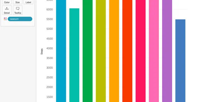
Clustered & Overlapped Bar Charts with Plotly Express
Clustered (Grouped) Bar Charts display numerical information about the relative proportion that exists between a main category and its subgroups (subcategories) that belong to a second categorical…
📚 Read more at Towards Data Science🔎 Find similar documents

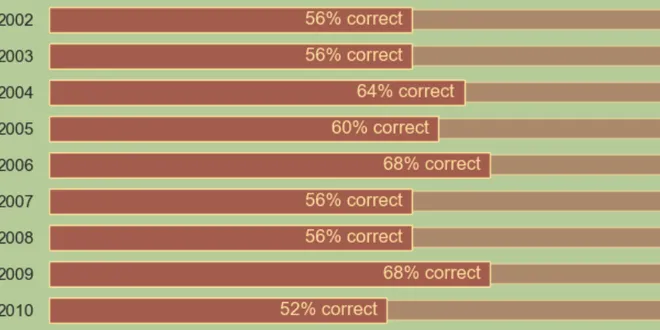
Clustered & Overlapped Bar Charts
Why: Clustered Bar Charts (CBC) display numerical information about the relative proportion that exists between a main category and its subgroups that belongs to a second categorical variable…
📚 Read more at Towards Data Science🔎 Find similar documents
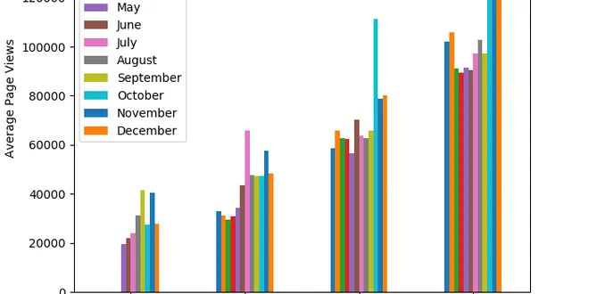
Create a grouped bar chart with Matplotlib and pandas
As I was working on freeCodeCamp’s Data Analysis with Python certification, I came across a tricky Matplotlib visualization: a grouped bar chart. I’ve been making my way through the projects, but the…...
📚 Read more at Analytics Vidhya🔎 Find similar documents
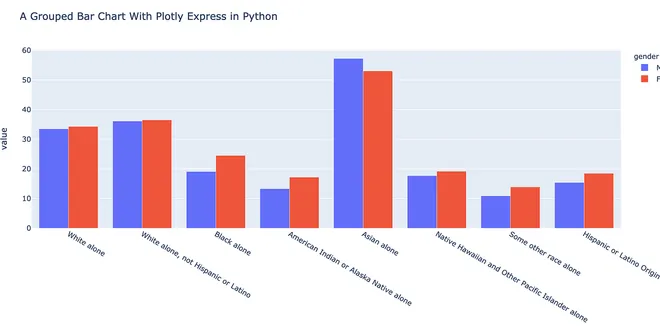
How to Create a Grouped Bar Chart With Plotly Express in Python
When you create a grouped bar chart, you need to use plotly.graph_objects. In this article, you will learn how to create a grouped bar chart by using Plotly.express. Plotly Express is a high-level…
📚 Read more at Towards Data Science🔎 Find similar documents

Bringing order into bar chart chaos
Bringing Order into Bar Chart Chaos Ordering the bars in a single and faceted ggplot2 bar chart Image by Author We all like order (or at least most of us). It helps us organize our thoughts and gives...
📚 Read more at Towards Data Science🔎 Find similar documents
Easy grouped bar charts in Python
A plot that I often want to create, but fail to remember how to, is a bar chart where there are two or more bars per entry or row from a DataFrame. The purpose of this is to compare two different…
📚 Read more at Towards Data Science🔎 Find similar documents
Bar Chart Race to Predict GDP Per Capita
To visualize the features of different categories we use bar charts which are a very simple way of presenting the features. But when we are having a lot of features in one category only then a bar…
📚 Read more at Becoming Human: Artificial Intelligence Magazine🔎 Find similar documents
Make a Nested Bar Chart with Seaborn
A nested bar chart is a visualization method that compares multiple measurements within categories. One of these measurements represents a secondary or background measure, such as a target or previous...
📚 Read more at Towards Data Science🔎 Find similar documents
Bored of using Bar charts?
Bar charts are one of the most used chart forms I use when presenting data insights at work. But I often feel like it gets a bit monotonous and repetitive especially when you need to present a lot of…...
📚 Read more at Towards Data Science🔎 Find similar documents
Different Bar Charts in Python
Bar charts are used to measure items across classes or to monitor changes over time. These are the one of the oldest charts that represents the data visualization through the “bars. These are one of…
📚 Read more at Towards Data Science🔎 Find similar documents

Grouped Barplot With Error Bars in R
A comprehensive guide to data preparation and visualization Photo by Paulius Dragunas on Unsplash Barplots are an essential and widely used visualization tool for several reasons. They are excellent ...
📚 Read more at Towards Data Science🔎 Find similar documents

Segmented Total Bar Chart in R with “`ggsegmentedtotalbar“`
Kevin Flerlage, who is a data visualization specialist, suggested a great alternative to stacked bar plot on his blog. He called this new alternative “segmented total bar plot”. This R package ggsegme...
📚 Read more at R-bloggers🔎 Find similar documents