plotnine
Plotnine is a powerful Python library that implements a grammar of graphics, allowing users to create complex and aesthetically pleasing visualizations with ease. Inspired by the popular R package ggplot2, plotnine abstracts the intricacies of plotting, enabling users to focus on the data and the story it tells. This library is particularly useful for exploratory data analysis, as it facilitates the visualization of various data patterns, trends, and irregularities. With plotnine, users can generate a wide range of plots, making it an essential tool for data scientists and analysts looking to enhance their data visualization capabilities.
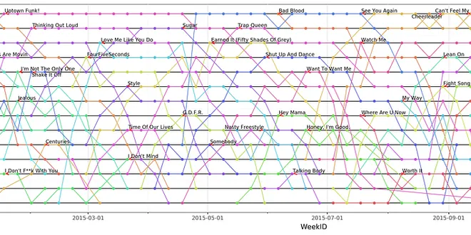
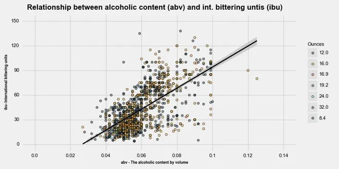
Plotnine plot deconstruction: visualizing the billboard hot 100
As far as I am concerned, ggplot2 is the best plotting package out there. So when I found out there was an implementation of the Grammar of Graphics for Python, plotnine, I jumped at the opportunity…
📚 Read more at Towards Data Science🔎 Find similar documents

Introduction to Plotnine as the Alternative of Data Visualization Package in Python
Data Visualization is the graphical representation of data. Plotnine is the implementation of the R package ggplot2 (grammar of graphics) in Python
📚 Read more at Towards Data Science🔎 Find similar documents
ggplot: Grammar of Graphics in Python with Plotnine
Do you wish that Python could emulate the superb visualizations that ggplot gives you in the R language? Well, it can. We are going to explore the capabilities of Plotnine, a visualization library…
📚 Read more at Towards Data Science🔎 Find similar documents
Graphing Your Data Like ggplot in Python With plotnine
A grammar of graphics is a high-level tool that allows you to create data plots in an efficient and consistent way. It abstracts most low-level details, letting you focus on creating meaningful and be...
📚 Read more at Real Python🔎 Find similar documents

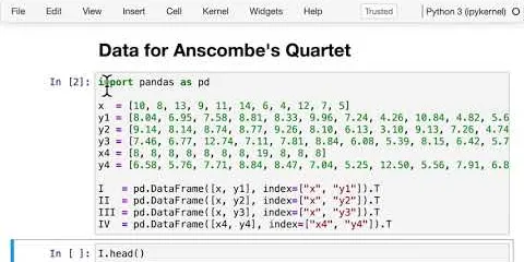
Create a Scientific Data Visualization from Scratch Using Plotnine in Python
This is the first part of the data visualization tutorial series where we will be showing you how to get started with python graphs using plotnine
📚 Read more at Towards Data Science🔎 Find similar documents
Matplotlib, Seaborn, Plotly and Plotnine Comparison
Matplotlib is a data visualization library in Python that is often used to create static, two-dimensional plots. Here is an example of how you might use Matplotlib to create a simple line plot…
📚 Read more at Python in Plain English🔎 Find similar documents

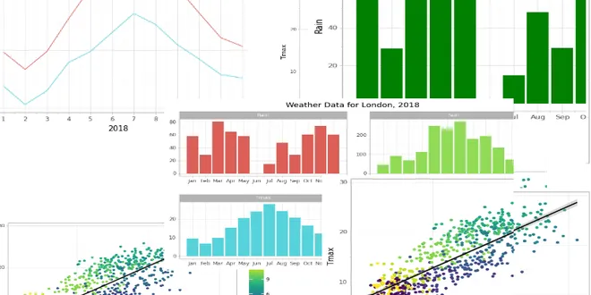
Step-by-Step Guide to Time Series Visualization Using Plotnine
Visualization is a quick and effective way of getting insights from your data. This article provides a step-by-step guide for exploring a time series using graphics. We’ll use 6 different plots to unc...
📚 Read more at Towards Data Science🔎 Find similar documents

Meet patchworklib: A Subplot Manager for Intuitive Layout in Matplotlib
Arrange multiple Matplotlib plots quickly using only the ‘|’ and ‘/’ operators with patchworklib. Photo by Carlos Muza on Unsplash Matplotlib is the most utilized and famous visualization package in ...
📚 Read more at Python in Plain English🔎 Find similar documents

Get Started with Plotly @ Jupyter Lab
What is Plotly? It’s an interactive Python graphing library. You can make many beautiful and engaging charts using Plotly, such as line plots, scatter plots, box plots, histograms, and heatmaps.
📚 Read more at Analytics Vidhya🔎 Find similar documents
Data Visualization in Python like in R’s ggplot2
If you love plotting your data with R’s ggplot2 but you are bound to use Python, the plotnine package is worth to look into as an alternative to matplotlib. In this post I show you how to get started…...
📚 Read more at Towards Data Science🔎 Find similar documents

Interactive Ternary Plots with Plotly
Plotly Python (plotly.py) is an open-source plotting library built on plotly javascript (plotly.js). One of the things I like about plotly.py is that it offers a high-level API (plotly express) and a…...
📚 Read more at Towards Data Science🔎 Find similar documents
Library of the week #8: Plotly
Why Plotly? When it comes to data visualization in Python, you want a library that offers both versatility and user-friendly interactive features. That’s where Plotly shines. Whether you’re just getti...
📚 Read more at Python in Plain English🔎 Find similar documents