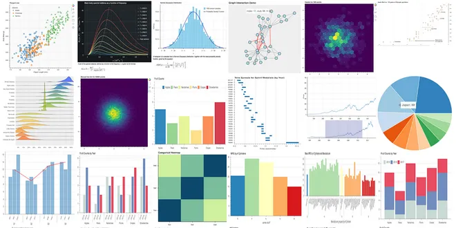
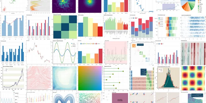
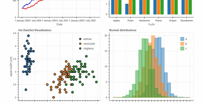
Bokeh
Bokeh is an interactive data visualization library designed for Python, enabling developers to create visually appealing graphics that can be rendered in modern web browsers. It simplifies the process of generating complex visualizations by allowing users to write code in Python while automatically generating the necessary JavaScript for web display. Bokeh is particularly useful for creating interactive plots, dashboards, and data applications, making it an excellent choice for those looking to visualize large or streaming datasets. Its elegant design and high-performance capabilities make it a popular tool among data scientists and analysts.

Bokeh
Bokeh is a data visualization library that builds visuals in Python and outputs them in JavaScript.
📚 Read more at Full Stack Python🔎 Find similar documents

Interactive Data Visualization with Python Using Bokeh
Recently I came over this library, learned a little about it, tried it, of course, and decided to share my thoughts. From official website: “Bokeh is an interactive visualization library that targets…...
📚 Read more at Towards Data Science🔎 Find similar documents

The Battle of Interactive Geographic Visualization Part 7 — Bokeh
Using the Bokeh Library to Create Beautiful, Interactive Geoplots Continue reading on Towards Data Science
📚 Read more at Towards Data Science🔎 Find similar documents
Start using this Interactive Data Visualization Library: Python Bokeh Tutorial
Data visualization is a key to Data Analysis. Whether to understand the hidden patterns or layers in Data or analyze the metrics or insights of a product or Expo our Analysis to Nontechnical Clients,...
📚 Read more at Towards AI🔎 Find similar documents
Interactive plotting with Bokeh
As a JupyterLab power user, I like using Bokeh for plotting because of its interactive plots. JupyterLab also offers an extension for interactive matplotlib, but it is slow and it crashes with bigger…...
📚 Read more at Towards Data Science🔎 Find similar documents

Bokeh Interactive Plots: Part 2
How to guide to building a custom interactive Bokeh app Photo by Visual Stories || Micheile on Unsplash Overview This is the second part of three part articles series covering Bokeh interactive visua...
📚 Read more at Towards Data Science🔎 Find similar documents

Data Visualization — Advanced Bokeh Techniques
If you are looking to create powerful data visualizations then you should consider using Bokeh. In an earlier article, “How to Create an Interactive Geographic Map Using Python and Bokeh”, I…
📚 Read more at Towards Data Science🔎 Find similar documents
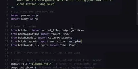
Python & Bokeh: From Data to Visualization
Building a data visualization with Bokeh involves the following steps: 1. Prepare the data 2. Determine where the visualization will be rendered 3. Set up the figure(s) 4. Connect to and draw your dat...
📚 Read more at Real Python🔎 Find similar documents

Data Visualization with Bokeh in Python, Part III: Making a Complete Dashboard
Sometimes I learn a data science technique to solve a specific problem. Other times, as with Bokeh, I try out a new tool because I see some cool projects on Twitter and think: “That looks pretty…
📚 Read more at Towards Data Science🔎 Find similar documents
Draw Beautiful and Interactive Line Charts Using Bokeh in Python
Draw fancy interactive line charts using Bokeh in Python. Customise legends, tooltips, y-axis scales. Data Analysts and Data Scientists must know.
📚 Read more at Towards Data Science🔎 Find similar documents

8 Tips for Creating Data Visualizations in Python using Bokeh
Quick tips and examples to create data visualizations using the Bokeh library Photo by Lukas Blazek on Unsplash Python is a great open-source tool to create data visualizations. There are many data v...
📚 Read more at Towards Data Science🔎 Find similar documents
Beautiful and Easy Plotting in Python — Pandas + Bokeh
Plot your dataset using Pandas + Bokeh from data frame to chart. Data visualization, Data Science, Python programming, that a Data analyst must know.
📚 Read more at Towards Data Science🔎 Find similar documents