bokeh
Bokeh is a powerful Python library designed for creating interactive data visualizations in modern web browsers. It allows developers to generate visually appealing charts and graphics using Python code, eliminating the need for complex JavaScript integration. Bokeh is particularly useful for building dashboards and applications that require high-performance interactivity, even with large datasets. Its simplicity enables users to create intricate visualizations with minimal code, while also offering advanced customization options for more experienced developers. Whether for academic research or business analytics, Bokeh provides an accessible way to present data effectively and engagingly.
Bokeh
Bokeh is a data visualization library that builds visuals in Python and outputs them in JavaScript.
📚 Read more at Full Stack Python🔎 Find similar documents
Python: Visualization with Bokeh
The Bokeh package is an interactive visualization library that uses web browsers for its presentation. Its goal is to provide graphics in the vein of D3.js that look elegant and are easy to construct....
📚 Read more at Mouse Vs Python🔎 Find similar documents

Interactive Data Visualization with Python Using Bokeh
Recently I came over this library, learned a little about it, tried it, of course, and decided to share my thoughts. From official website: “Bokeh is an interactive visualization library that targets…...
📚 Read more at Towards Data Science🔎 Find similar documents
Start using this Interactive Data Visualization Library: Python Bokeh Tutorial
Data visualization is a key to Data Analysis. Whether to understand the hidden patterns or layers in Data or analyze the metrics or insights of a product or Expo our Analysis to Nontechnical Clients,...
📚 Read more at Towards AI🔎 Find similar documents

Getting started with Bokeh — Effortlessly elegant interactive data visualisations in Python
Getting started with Bokeh— Build elegant interactive data visualisations effortlessly in Python
📚 Read more at Towards Data Science🔎 Find similar documents
Bokeh, Bokehjs and Observablehq
By combining the bokehjs library with Observable you get an interesting alternative to python and bokeh in Jupyter notebooks.
📚 Read more at Towards Data Science🔎 Find similar documents

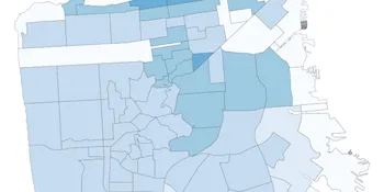
The Battle of Interactive Geographic Visualization Part 7 — Bokeh
Using the Bokeh Library to Create Beautiful, Interactive Geoplots Continue reading on Towards Data Science
📚 Read more at Towards Data Science🔎 Find similar documents

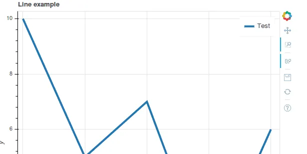
Bokeh Interactive Plots: Part 1
How to guide to build a custom interactive Bokeh app Photo by Yiorgos Ntrahas on Unsplash Project Overview The best way to understand both the big-picture trends and the nuances of a data set is to e...
📚 Read more at Towards Data Science🔎 Find similar documents
Data Visualization — Advanced Bokeh Techniques
If you are looking to create powerful data visualizations then you should consider using Bokeh. In an earlier article, “How to Create an Interactive Geographic Map Using Python and Bokeh”, I…
📚 Read more at Towards Data Science🔎 Find similar documents
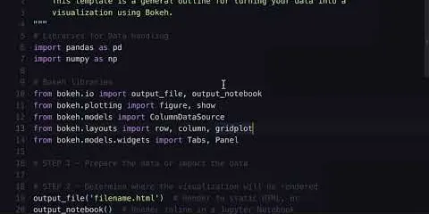
Python & Bokeh: From Data to Visualization
Building a data visualization with Bokeh involves the following steps: 1. Prepare the data 2. Determine where the visualization will be rendered 3. Set up the figure(s) 4. Connect to and draw your dat...
📚 Read more at Real Python🔎 Find similar documents

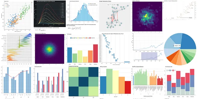
8 Tips for Creating Data Visualizations in Python using Bokeh
Quick tips and examples to create data visualizations using the Bokeh library Photo by Lukas Blazek on Unsplash Python is a great open-source tool to create data visualizations. There are many data v...
📚 Read more at Towards Data Science🔎 Find similar documents
Data Visualization Using Pandas Bokeh
Exploratory data analysis is the foundation for understanding and building effective ML models. Data visualization is a key part of EDA, and there are many tools available for this. Bokeh is an…
📚 Read more at Towards Data Science🔎 Find similar documents